
Six Examples of Why Line Weights Matter
In any design drawing, both sketches and technical drawings, the unsung hero of the drawing is line weight. Varying the line weight, that is the thickness of the lines, will always add more depth and character to your drawings. Even the simplest of drawings will look more polished and professional with a bit of line weight variety. Let’s look at some examples to see what I mean.
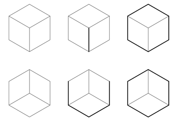
A cube
Look at these 6 cubes. These are all composed of the same lines, same angles, etc. The two on the left have no variety in the line weight, whereas the other 4 have a different hierarchy . These all show a cubic volume but what do you see in the ones with a varied line weight? Do you see a cube with one corner closest to you? Do you see 3 planes coming together to create a cubic space?
A perspective sketch
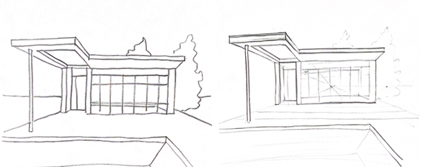
Let’s look at these hand drawn perspective sketches. For the drawing on the left, nearly even pressure was applied for every line. For the drawing on the right, on the other hand, heavier pressure was applied on lines representing objects that were closer to the viewing position while lighter pressure was applied on lines representing objects that were farther from the viewing position. One drawing starts to look a bit more cartoon-like while the other has just a bit more character and depth. This is all down to line weight.
A plan drawing
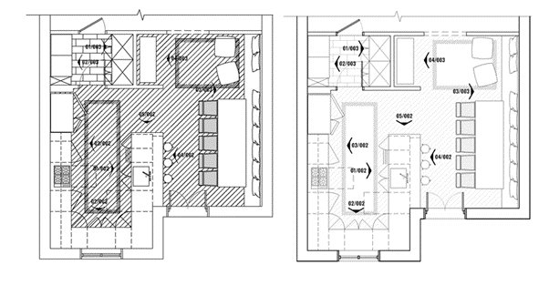
Varied line weight in plan is essential. A drawing that has no variety in the line weight will look either dull or busy. In this plan drawing on the left, the same line weight is applied throughout. As a result the drawing just looks a bit messy even though there’s a nice level of detail. Alternatively, the same exact space is drawn with variety in the line weight. The walls and elevation symbols are drawn thicker. This is especially important for the walls to show that they are ‘cut’ objects. The furniture and the joinery is drawn a bit thinner, and the details like the floor pattern are shown very thin where they aren’t as visually dominant. This creates visual depth even though it’s a 2D drawing.
An elevation drawing
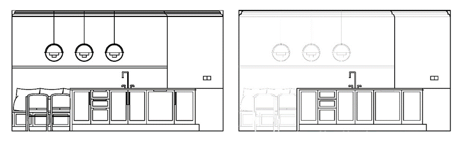
Similarly, let’s look at how line weight works in this elevation drawing. On the left, everything is drawn at the same line weight. As a result, the kitchen and the dining area beyond it start to visually blend together. It’s difficult to understand how these spaces interact. Alternatively, the drawing on the right shows the dining area drawn thinner and lighter compared to the kitchen. This helps indicate that it’s a space that exists further behind this kitchen counter.
A section drawing
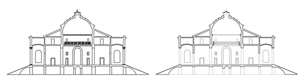
In section drawings, line weight is most important in showing what is ‘cut’ by the section line versus what appears in elevation beyond the section line. Take these two section drawings of the Villa Capra Rotonda (See this Section Drawing blog post). The one on the left has no variety in the line weight where the one on the right shows the ‘cut’ walls, ceilings, and floors in a much thicker line weight compared to the architecture beyond the section ‘cut’. This slight difference makes one drawing very apparent in showing an interior space and one just a bit confusing.
A detail drawing
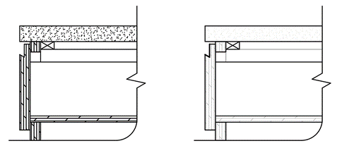
And finally, let’s look at line weights in a detailed drawing. Here’s a very simple joinery detail of a cupboard with a worktop and drawer. On the left, there’s no variety in line weight while on the right there is. Just as with the full building section drawing, here showing the ‘cut’ objects with a thicker line weight than the objects that are seen beyond the ‘cut’ of the section detail helps visually indicate how these objects relate to each other three-dimensionally despite being a 2D drawing.
With these examples, could you give a before and after line weight experiment with your own drawings? Look at a favourite sketch or drawing. Could you change the thickness of some of these lines to give the drawing more character in depth without drawing any more detail?
Let me know how it works for you in the comments.
 |
4 thoughts on “Six Examples of Why Line Weights Matter”
Leave a Reply
> Next Post Student Association study event: Visual Art and Text
< Previous Post Student stories: Annalisa Mercuri
Interior Design – Competition time!
2 Comments
The British Institute of Interior Design (BIID) has recently announced that entry is now...
Read more
Critical reviews in Interior Design
3 Comments
Just before Christmas I was lucky enough to be invited to take part in...
Read more
Introducing our Interior Design External Examiner, Marianna Velissaropoulou
3 Comments
With assessment events held regularly three times a year, many of you will be...
Read more
Department stories: Interior Design
4 Comments
The Architecture Room at the Royal Academy Summer Exhibition has been curated this year...
Read more
Great tips – thanks Audrey! It’s so useful to see examples showing the difference a change in line-weight makes…
This has really made me think, thanks!
Glad you liked it!
Good explanation, especially I liked audio part. thank you.