
Presentation tips for Interior Designers
Top 10 Graphics/Presentation Tips for Interior Designers
While interior designers’ priority is designing spatial environments, so much of our job is also communicating our ideas for these spatial environments. One of the realities of this industry is that a great idea that’s presented poorly will almost always lose to a mediocre idea that’s presented well. Poor presentation can distract an audience from the content of your work. As a result, it’s always a good idea to keep in mind some basics when it comes to graphics and presentation. Interior designers by no means have to be professionals when it comes to graphic design, but they should adhere to some basic principles. Here are my top 10 tips for graphics/presentations for interior designers.
- 1. Check your image quality.
Images with low resolution will immediately call attention to themselves in a negative way. Yes, zoomed way out, that photo might look ok, but make sure it looks good zoomed in to 100% too.

- 2. Align edges where appropriate.
When you want the focus to be on the work, it helps to keep your composition simple and polished. Here are two mood boards, one where the edges have been purposefully aligned and one where the images are arranged with not particular alignment. Your audience will wonder what the arrangement is for on the bottom one, where the top one is all about what those images communicate.

- 3. Use margins with text.
Our brains have been trained to expect a little breathing room between any text and the edge of the page or screen. Respect that and give some margins to your text.

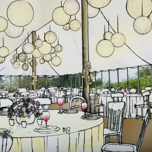
- 4. Be intentional with your choice of fonts.
Fonts are pretty powerful if you let them be. As a result, you want to make sure they’re very intentional. Is it a title? Is it text that you want to be noticed last? Choose basic fonts when you don’t want it to be distracting. Use something more special only when you want to call attention to it. Look at the two compositions below. For the top one, the script font is hard to read and a bit distracting, while the title doesn’t seem special in any way. The bottom composition on the other hand uses a title with a bit more visual weight, and the rest of the text is quite light and simple, meaning it’s not distracting from the images.

- 5. Use effects sparingly, let the work speak for itself.
Software makes it way too easy to play with various effects for imagery and text. Don’t fall victim to it. While there may be a time and a place for a nice effect, most of the time, you want your own imagery and writing to be the focal point of a composition.

- 6. Consider your visual hierarchy.
Always think about what you want to be most important and least important in a presentation. The size, location, weight, colour, contrast, saturation, etc. can all have an impact on what appears to be most important versus least important when it comes to a composition. Experiment with it. Ask friends and family what they think to check if it aligns with your intention.

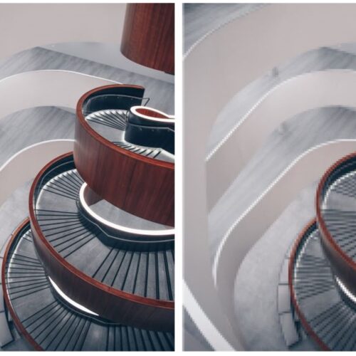
- 7. Don’t let your graphics be more interesting than the design.
There’s a time and a place for really experimenting with your graphics. But don’t let that come at the expense of the work being shown. Look at these two compositions. The top one might be more experimental and appropriate if it was a book cover about staircases, but the bottom one is likely better if you’re wanting people to actually pay attention to what’s being shown in the image.

- 8. Know the on-screen and off-screen sizes of things.
Zooming at 100% is always some of my first advice to students. Designing a layout or composition on screen makes it too easy to make assumptions about the sizes of things. But be vigilant! Size 18pt font may look absolutely fine on screen, but it might be way too big on a printed page. Also, that image you see perfectly when zoomed at 250% will likely be a bit of a mystery when zoomed back out to 100%.
- 9. Be Consistent.
One of the biggest clues that graphics haven’t been thoughtfully considered is when there’s just a lack of consistency. For one presentation, be consistent and cohesive when it comes to sizing and layout, colours and fonts, style and effects. That consistency will allow the work to be viewed as a whole.
- 10. Try something, test it, then try again.
Lastly, as with any design task, don’t be afraid to work iteratively. For a presentation document, don’t automatically default to your first try. Test out a few options. Get the opinions and feedback of others and refine it. When it matters, that extra effort can make the difference in how your design work is viewed.
Do you have any top tips when it comes to presentation?
 |
3 thoughts on “Presentation tips for Interior Designers”
Leave a Reply
> Next Post Thinking about making and physical objects
< Previous Post Student Exhibition – Alistair McIntyre
Interior Design – Competition time!
2 Comments
The British Institute of Interior Design (BIID) has recently announced that entry is now...
Read more
Critical reviews in Interior Design
3 Comments
Just before Christmas I was lucky enough to be invited to take part in...
Read more
Introducing our Interior Design External Examiner, Marianna Velissaropoulou
3 Comments
With assessment events held regularly three times a year, many of you will be...
Read more
Department stories: Interior Design
6 Comments
The Architecture Room at the Royal Academy Summer Exhibition has been curated this year...
Read more
Thanks Audrey, a very helpful blog, visual hierarchy is something I know I need to work on and more often than not I concentrate more on the images than the size of the font, just need to keep practising!
Glad you found it helpful, Tracy!
Cool post. Thanks Audrey!