
Study event review: OCA Thames Valley Group
Having a Relationship with your Printer
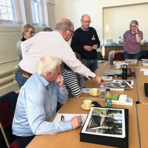
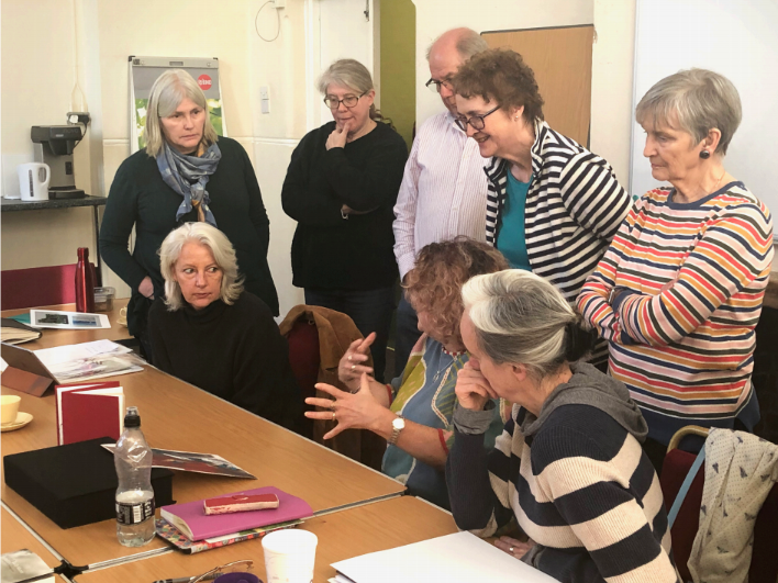
John Umney, a previous member of the Thames Valley Group and OCA Photography Degree Graduate, kindly came to give us a talk about printing, drawing on 30+ years as a photographer working in both analogue and digital and always printing his own work.
We spent the morning discussing prints we had brought in, which helped develop a common vocabulary and understanding of the parameters involved. A key point was to understand the intention of the image to allow the print to reflect that. For example John saw contrasty prints as didactic and preferred more nuanced prints with less contrast. This recurred later when John talked about his own work, as he saw his early prints as craft (a making skill) and his later work as art (a communication skill). The tones of the print affect the mood (warmer or cooler) and the paper tones need to work with this (ivory is warmer, bright white is cooler). We also noticed how much of a difference looking at the prints in different lights made to this. An extension of this is the context in which the print will be viewed, which must of course be understood.
With this in mind it is important to build the relationship with objects you can rely on, allowing the creative process to sit on top of this. To this end the next part of the session was a technical review.
John advised keeping choices to a minimum to start with, before tweaking parts of the process when you are comfortable with them. The elements in this workflow are:
1. Camera
2. Film (for analogue)
3. Display (for digital, or scans from analogue)
4. Printer
5. Paper
John advocated cleaning the print nozzles before printing. The importance of calibrating the screen (and keeping it clean!) was also discussed, for example using a Spyder or ColorMunki. Someone also mentioned an issue with using anti-glare glasses as they have a tint which tones the white balance. Another person mentioned the importance of turning down the brightness on the screen (I have found this to be the single most important adjustment to get a print to look like its image on the screen). Laptop screens tend to be less reliable.
Buying the correct ink (e.g. epson ink for epson printers) is also important. The printing software (not the printer) should control the colour and the correct profile combination for printer/paper should be used (these can be downloaded from the paper manufacturer). These profiles can also be used for soft proofing – while John suggested trying this it did not seem an essential part of the process and this reflected my own experience that it is overly-hopeful to rely on this to reflect precisely what will appear on the print.
John uses Canson Baryta paper, but to make test prints he uses an HP gloss paper (with the Canson paper profile) that is 10 times cheaper but gives very similar tones. We also discussed the advice of Mimi Mollica not to print on A sizes to avoid a print looking like stationary, although most paper comes in A sizes these days. For those of us who had experienced issues with thicker paper it was advised to try the back feed of the printer as opposed to the top feed.
It was also pointed out that the printer in the relationship can be a human being, providing a printing service. But it is still important to build a working connection with this person/firm to get good results.
Once we had reviewed the technical aspects we spent some time looking at John’s own prints and the way they were presented for assessment, which was useful in preparing our own work.
 |
> Next Post Student stories: Andy Be, Photography.
< Previous Post Student work: Ramona Mason
Study event review: Interior Design & Garden Design
2 Comments
On a sunny Saturday in November a group of Interior Design and Garden Design...
Read more
Study event review: Contemporary Painting Prize
0 Comments
A small but dedicated group of painters spent a drizzly afternoon in Huddersfield looking...
Read more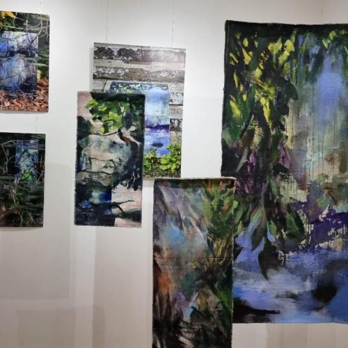
Study event review: London, September 22
3 Comments
OCA student Dhama reviews a recent study event in London to two OCA student...
Read more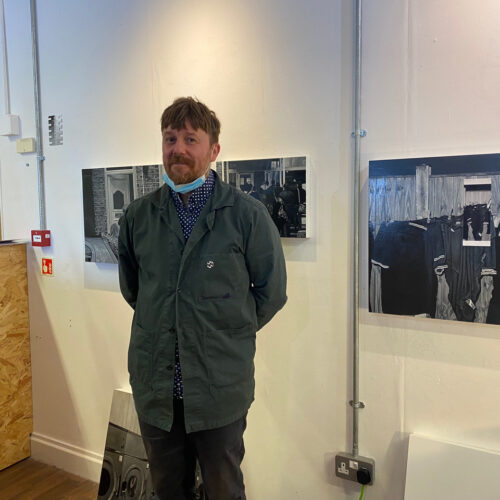
Study event review: Nathan Eastwood’s studio
1 Comments
After an excellent visit to Eddie’s ‘End of Degree Show’ in the morning at...
Read more