

Red over red
 In January of this year, Peter York invited me to exhibit with him at the Heartbeat Gallery – a new gallery in Sheffield. I agreed straight away because I felt that Pete’s approach to making images, with its mixture of drawing and pattern improvisation would work well with my own work. We decided on ‘Red’ as a theme. I was relieved – largely because much of my work over the last year has been an exploration of red in a broad sense and I knew that I could never make enough new work in four months to fill the available space in the gallery, as most of my most important current work has been in book form; I also saw it as an opportunity to show a large 3 metre high x 1.6 metre hanging, (Red over Red – pictured above) made in 2006 which, because of its height is very difficult to exhibit. The gallery is ideal for a free hanging piece and I have found it useful in the past to have one spectacular large piece as a focus for the other smaller work.
I also wanted to have some books which could be handled. There is a dilemma in the idea of a book as a work of art. Books have to be touched to turn the page; A page has to be turned to read the information, whether visual or written, but then do you want your artwork to be handled to destruction? A book can have the quality of a sculpture, inviting the viewer to simply look, yet with content that might have to be explored page by page. This duality both fascinates me yet creates a problem I have to solve every time I design the form a book might take. Part of the exciting thing about making books is in surprising the viewer with a glimpse of something over or through the page, behind the page, even hidden in the translucent page, which might be experienced through touch. Another way of getting over this problem is to have a ‘handling’ copy on display which I think can add a welcome degree of interactivity to an exhibition.

The newest book in the exhibition is Notes from the Desert – a book and sequence of images based on the drawings, photos and memories of a journey made in February 2009 to the Colorado Plateau in Northern Arizona.

This group of work took three years and many discarded visuals before I felt that the idea was strong enough to show any of the work. I returned to the idea earlier this year and decided to focus entirely on developing of a sequence of images about the journey and to think about format later. As it began to take shape I made several proof copies trying several different formats for constructing the page sequence together. After several mock ups I decided to use a construction where the page is folded at the fore edge, as in a Japanese book, then side stitching each page to the next by machine. This format, (because the pages are not fixed together in to the spine) does not restrict the view of the page as in a perfect bound book yet when it is open horizontally, it has a particular sculptural quality which exploits the flexibility, yet strength of paper. The first and last pages are sewn into the cover to make what is sometimes known as a ‘collapsing star’ format. Another great advantage of this format is in that pages can be turned by placing the hand between the pages, so that only the reverse of the page is touched, rather than the printed surface – minimising damage by handling. I made this book in two editions. A book where every page is a hand layered collage which I might make as a very small edition and a paper copy using a beautiful cotton rag paper (Innova Cotton high White) with a surface coated with an ink receptor which yields superb colour quality.

About six images, I felt, were able to stand alone and be developed into mixed media collage panels and framed.

The other significantly new work is a series of books exploring ‘Red’ which began towards the end of last year. The series draws on environments which are almost surreal in the colour. In particular the iron pools of Iceland, canyons of Arizona and the ocre quarries of Provence. I wanted to push the hue red to its limits; different reds are juxtaposed and overlaid – using crayon, acrylic, digital colour, thread, recycled red dyed pattern. I solved a lot of digital print colour problems during this time. Achieving the intensity of reds proved hard on the uncoated collage substrate. And I found that I had to jump through a series of hoops to get the colour I wanted. I already had a custom ICM colour profile for my own paper, which I embed in my digital file, but it is so easy to forget one step and have a disastrously dull print.
Looking at the work in the exhibition has forced me to think hard about drawing and the change in my approach to drawing. I realise how little time I give to that process of recording through drawing compared with 10 years ago. Instead, I think of this process as collecting visual material, whether through drawing with pencil, photographing, collecting ephemera.
In a sense I am using the computer as the next step in the process of making a drawing. I scan visual material which becomes the marks, shapes and colours with which I work on screen. I can then add colour, textural illusion, cutting, pasting material. Etc. This is, of course only part of the process. The tactile is as important as the virtual. I have to create a substrate – the collage – in which, (when it is wet) I add shapes – using scissors to draw, and on which (after it has dried) I add marks to resist the print; The printed colour and the collage substrate combine and I often continue to add marks. Each ‘drawing’ is part of a sequence of events. This sequence – revealing the thought process page by page can evolve into a book – each image different, yet linked. I have been working this way since the mid 90’s. In the early days, I didn’t know what to call this vast amount of experimental digital print material I was producing but I realised that the computer was a tool on which an idea could evolve faster than anything else I have ever experienced. I didn’t discard pencil, paper, simply added a new dimension to my drawings. In some ways it is liberating to think of these as drawings. For me a drawing is about searching for a solution; working out an idea, a thought, a memory of a feeling I had. A drawing also has the possibility to change to evolve. I think that my work often explores the idea of arresting a train of thought at a certain point. I continually recycle pattern and drawing fragments from my notebooks or from computer files, pick up a train of thought years later and follow a new path.
Pete’s work for the exhibition combines pattern and myth to make prints in which even the buildings he draws are filled with energy. We were both conscious at the end that although we had shared a theme, we had worked separately, almost producing two separate solo exhibitions. We are already planning the next exhibition – possibly a more collaborative one, possibly using a location as a focus, and one in which our working notebooks will play an essential part in the exhibition.
Heartbeat Gallery
1 June — 30 June 2012
Open: Tues — Sat, 11am — 6pm
The Orchard Centre
14-18 West Bar Green
Sheffield S1 2DA
For more photos and a review of the exhibition and more about Peter York’s work.
8 thoughts on “Red over red”
Leave a Reply
> Next Post Tanya speaks
< Previous Post Sticks and stones
Artlab23 Collective
0 Comments
The aim of the Collective is to provide a mutually supportive environment which will...
Read more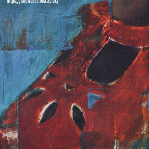
OCA’s Online Degree Show Showcase 2023
0 Comments
Welcome to our online Degree Show Showcase 22/23 where we are celebrating a number...
Read more
Student stories – Jane Murdock
4 Comments
The grant, by enabling the partaking of this exhibition, has produced some long-term affects...
Read more
Student exhibition: Beverley Williams
14 Comments
OCA Textiles Student Beverley Williams will be culminating her studies with an upcoming exhibition...
Read more
Interesting and complicated. I like the notion of focussing on a colour and know just what you are talking about with reference to the iron pools in Iceland (which is quite a stark black and white country, but with flashes of colour) and the ochre mines of Rousillon. Work made about journies is always fascinating to me.
Actually, Olivia, I was in Iceland in August and the whole country was filled with colour. I expected grey and black and I found a country filled with colour and texture. The greens, in particular were much stronger – possibly because of the mosses which seem to dominate. I think I would like to see the country in Winter.
journeys
I’ve made a few artists books – but don’t understand what you mean by the ‘collapsing star’ structure. As I’m having problems at the moment with making a star format book, I’d really like to know the details. Can you point me in the direction of an explanation somewhere – or examples where you can see the construction?
A collapsing Star format is very like a concertina book, but it is fixed in some way to the cover, so that it can not be opened flat on a ‘long line’, or hung. I couldn’t thnk what else to call it. I dont know who invented the title, but I have a book I bought in the 1990’s by Andi McGarry of Sun, Moon and stars press in Ireland which he called a collapsible star. It is a concertina format simply glued into the cover. A good book to get, if you can find it is Keith A. Smith’s ‘Non adhesive Binding’ ISBN 0-9637682-0-4
Any of his books on making books are inspirational.
Thank you! I’m part-way through making a star concertina book, but was planning for it to have a box instead of a cover – now I shall think again!
Thank you so much for this extremely stimulating blog…just love the ideas here and as one who had never tried to express visual ideas in the form of a book, I am fired up….love the colour idea too.
Great!
It is all about telling stories. Visual stories as well as written ones. Think about only showing part of an image on one page, then another bit – etc. this is simplistic, but it is about trying to make people ‘turn the page’ to find out what is on the other side. In a way, a game. I made one book which was simply an image, then cut it into 12 equal pages, and gave it to a friend as a leaving present. She had to find the right order to recreate the image to ‘read’it.