

John Virtue

John Virtue, in this short video that was shown on the BBC’s Culture Show, gives us an insight into what it’s like to make an extended body of work centred on a location and in relation to works of art. He moves easily from talking about the iconography with which he’s working, the surface quality of the paintings, and how he sees those paintings fitting into a larger tradition.
Virtue triangulates a position for his work by deliberately relating his practice to Constable and other landscape painters. Now you might think ‘he’s a professional artist and it doesn’t seem conceited or arrogant, whereas if I, a student, claimed something similar it would be silly and arrogant.’ But there’s real value in working out a position by looking at art that already exists. Virtue singles out some gestures and marks and likens them to his own. They aren’t the same, but he sees a link.
He also works to understand how paintings are put together, seeing compositions as structural and abstract, despite being ‘of’ buildings. He edits and shifts picture elements, using bits of his own drawings collaged to create starting points for large work. He deliberately leaves out things saying, ‘I’ve never felt any need to put in cranes and buses and cars and aeroplanes’. Working out what you want to show in a view is important. Drawing every single thing is relatively easy as there’s no choice, no intervention, just a technical demand to replicate. Here we see an artist shoving bits of visual research together to make something new. He isn’t providing a large detailed image that people can use to point at and say ‘that’s where we had lunch’, or ‘that’s not quite right, St Paul’s is bigger than that. He’s making a NEW THING from material gathered when looking at other things. I wrote about this in my post about Edward Hopper’s Nighthawks.
His painting technique is a strange combination of rigour and promiscuity. He uses -and says that he has used for 26 years – black ink mixed with shellac, and titanium acrylic on unprimed canvas. That’s the rigour. The promiscuity (his word), is in the tools he uses to make marks. Cloths, brushes, rags and sprays are all evident and it looks like he’s scraping stuff off, too. All of this creates a complex and vibrant monochrome surface. The scale of the works is obviously a huge factor when the works are encountered and it foregrounds a picture’s surface qualities.
Throughout the film, there’s a palpable sense of an artist simply working stuff out. That isn’t complicated. It’s the consequences that are complicated. He wrestles with art history, materials, London and so on. All of the thinking is played out for us. Richard Sennett, in his excellent book The Craftsman, writes that ‘making is thinking’, and we see evidence of that here. I doubt that Virtue thinks about art as a grand thing, but as a way of getting at something that can’t be found in any other way.
The final section of the film gives us an insight in to installing a show of work. It’s instructive to see that he takes ownership of all sorts of decisions and that an artist’s role doesn’t end with the making of the work. When it’s displayed and encountered by others, there’s potential for the maker to wield some agency. That’s not always possible, especially in group shows, but it’s something worth thinking about.
What can we take from this?
So, as students (and I include myself in this description), what might we take from the film?
- Find works or art whose material qualities you admire, test your own work against it, and write about how you get on. Remember that you needn’t ‘like’ or ‘admire’ the artist (though Virtue clearly does), just recognize that there’s something you can draw on. Be hard on yourself and keep trying.
- Use drawing as a tool to figure out how things in the world interlock. Then interlock those drawings to make something new. Scale that up (remember the grid exercise?) and work on that. Remember that a detailed little drawing scaled up spreads the information over a larger field. This is where gesture and material play a part in creating interest.
- Be simultaneously rigorous and promiscuous. Restricting a part of your technique will give you the chance to test other areas without getting confused. If everything’s changing all the time, then there’s no yardstick.
- Working large isn’t easy for lots of reasons (many simply spatial), but the gestures it allows an artist to make are physically different. Try it and you’ll start using your shoulder and trunk. It’s suddenly a very physical and tiring activity. Not being able to see the whole thing on one go is strange at first, too.
- When you get the chance to show work, think about how it might, or might not, be framed or mounted. How might it be attached to the wall? What colour should that wall be? How high up? Even if you just fantasize about these elements (and drawing sketches of galleries with your work in is fun, too), you will start to see your work differently. Try it.
As an afterword, the relation of the photography in the film is interesting, too. It tries to mimic the look of the paintings in a way, but only partially succeeds. Perhaps some photographers would like to comment on this as it raises some points about representation and so on. Perhaps I’m simply surprised they didn’t make it a black and white film, but that might have been a bit too obvious.
9 thoughts on “John Virtue”
Leave a Reply
> Next Post Sketchbook Circle
< Previous Post Edinburgh Study Visit

Drawing Department 2023 Assessment Showcase
8 Comments
As Programme Leader for the BA (Hons) Drawing Degree I am really pleased to...
Read moreArtlab23 Collective
0 Comments
The aim of the Collective is to provide a mutually supportive environment which will...
Read more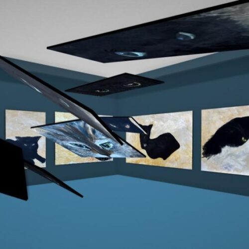
Student stories: Explorations in Drawing, Painting, Mixed Media, and Technology
16 Comments
I am delighted to launch this exhibition; Explorations in Drawing, Painting, Mixed Media, and Technology;...
Read more
Goodbye to Drawing Programme Tutor Charlie Duck
2 Comments
As Programme Leader for Drawing I have been privileged to work with Drawing Programme Tutor...
Read more
I would love to see those paintings!!! What a great insight to see such a great technique in action! If I only had the room…maybe the garden fence wont mind having a little abstract decoration?!?
About a month ago I was searching for monochromatic landscapes on the internet. I managed to grab a few atmosperic, black and wight paintings I admired to save on my desktop but alas, as I was quickly running out of time I forgot to get a name to go with these paintings.
Returning a few days later I was unable to remember or find the source of these images which was very frustrated. I had resigned myself to never finding out who this mysterious artist was.
I was delighted to find your post all about John Virtue as he is clearly the artist I was searching for. His black ink mixed with shellac paintings are so distinctive with a unique voice.
The video is very insightful. I was at first surprised by his love of Constable. There work seems worlds apart to the untrained eye. How interesting when Virtue describes the underling structural elements of Constable’s painting as timeless. Also how he points out the rainbow as a beautiful mark. Which made me imagine Constable making it with the curb of an out stretched arm perhaps.
It has made me think I might start taking super quick sketches of works I admire in galleries. Just jotting down the main structural shapes to see what I end up with and if these could translate to my own work. ( as you suggest in your bullet points.)
The V.T and the accompanying article have been very inspiring as I work towards the finishing touches of assignment 3, ‘view from a window or open door.’
It’s a shame the exhibition finished 9 years ago. I’d love to see his paintings face to canvas.
Thanks for posting!
Some years ago I went to an exhibition of Virtue’s work at (I think) Somerset House and was really disappointed. I had seen his work in reproduction and on TV and was looking forward to seeing them in the flesh but I found his drawings unconvincing as anything more than a rough layout scheme and seeing the process so obviously on the surface of the canvas didn’t work for me, they looked so much more successful in repro…a real shame. I hope that the newer works will work better for me if I can get to see them.
Go see them for yourselves and make your own minds up.
Reading my last post seems to suggest that I know of a current exhibition of Virtue’s work…I don’t but would be interested to see what he is doing currently.
I like what he says about not being able to think about anything more exciting to do with one’s life. Despite the struggles we are fortunate to be artists.
Although I’m not really a fan of this kind of work, I admire the process. Realising what’s REALLY interesting about the thing that interests you is an important thing to grasp. It’s only when he tells you what’s excluded that you notice it. He uses visual research (sketches and so on) to build a kind of path away from any realistic or wholly representational version of the city, which allows something else to creep in. I know I bang on about labour and work, but it shows here that even work we might consider rooted in a visual transfer: landscape to painting, there’s a real and plottable journey going on. The jounrey and its documentation are bound together in the studies. Just walking through the city would work. Just making drawings of the city wouildn’t work. It’s the linking of doing and thinking (and thinking about doing) that makes it catch fire.Being present with your own work is crucial to its success I think.
That should say ‘just walking through the city WOULDN’T work.
I’ve only ever seen one Virtue paintings for real, when there was an exhibition in Birmingham of the Government Art Collection, but it made my day. Thank you so much for this video & the comments. Finding a way a serious scaling-up is a real challenge.
More recently, Virtue has been working on seascapes – he’s represented, I believe, by the Marlborough Galleries, so have put myself on their mailing list – so far, no news. His London paintings show the indirect influence of David Bomberg’s late landscapes, especially his London drawings in charcoal.